How to Make Every Font Render Sharply on Linux From the First Pixel
If you have ever installed a fresh Linux distribution, opened the same web page that looked beautiful on macOS the day before, and stared at slightly fuzzy letters wondering why the text feels off, you have met the most stubborn quality problem in the open-source desktop. Font rendering on Linux is not worse than on commercial operating systems. It is configurable to a degree that the others do not expose, and that configurability is the reason every fresh install looks slightly different out of the box.
This guide walks through what is actually happening under the hood, the levers Fontmatrix and fontconfig give you to fix it, and a set of sensible defaults that produce sharp, consistent rendering on almost any modern Linux desktop.
Why Linux Renders Fonts Differently
Three subsystems decide what a glyph looks like on your screen on Linux.
The first is FreeType, the rasteriser that turns the mathematical outlines stored in a font file into pixels. FreeType is the same on Linux, FreeBSD and most BSDs, and it has been mature for two decades. It is not the source of the problem.
The second is fontconfig, the policy layer that decides which font to use when an application asks for a family by name, which alternate to substitute when the requested font is not installed, and how the rasteriser should behave for a particular family. Most rendering complaints are fontconfig configuration issues, not FreeType issues.
The third is the toolkit, GTK or Qt, which applies its own assumptions about anti-aliasing, hinting and DPI before handing the request to fontconfig. This is the layer where applications can override system defaults, which explains why two programs displaying the same font on the same screen can look meaningfully different.
Until 2019, FreeType also defaulted to a less aggressive form of hinting because the patents on Microsoft's ClearType subpixel rendering technique were still in force. When those patents expired, every major distribution quietly switched to the full subpixel path, and Linux font rendering took a visible step forward overnight. Anyone who remembers the rendering of 2018 and compares it to today is comparing fundamentally different defaults.
The Three Levers That Actually Matter
There are dozens of font rendering settings on Linux. Three of them produce ninety per cent of the visible difference.
The first lever is hinting, the instructions baked into a font that tell the rasteriser how to deform a glyph to align with the pixel grid at small sizes. Hinting can be set to none, slight, medium or full. The right value depends on whether the font carries its own hinting instructions and how good they are. For most modern fonts on a high-DPI display, slight produces the cleanest result. For older bitmap-derived fonts on a 96 DPI display, full often wins. Setting medium is a compromise that rarely produces the best of either world.
The second lever is anti-aliasing, which decides whether intermediate pixels are filled with shades of grey or shades of red, green and blue. Grayscale anti-aliasing is universal. Subpixel anti-aliasing, also called RGB or BGR depending on your monitor's pixel order, is only useful on conventional LCD panels. If you are on an OLED, the subpixel order is irregular, and grayscale is the safer choice.
The third lever is the LCD filter, which applies a small blur to reduce the colour fringing that subpixel rendering can produce. The default value, lcddefault, works on the vast majority of monitors. A small minority of users with unusual pixel arrangements benefit from lcdlight or lcdlegacy.
A Sensible Default Configuration
The following fontconfig rules produce sharp, consistent text on most Linux desktops in 2026. Place them in ~/.config/fontconfig/fonts.conf and reload with fc-cache -f -v.
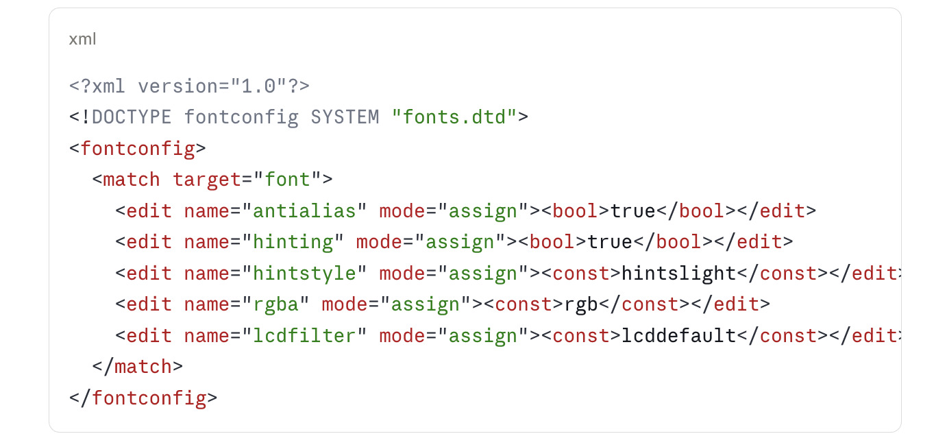
If you are on an OLED display, replace rgb with none and the rendering will switch to pure grayscale anti-aliasing, which avoids the colour-fringe artefacts that subpixel rendering can produce on OLED subpixel layouts.
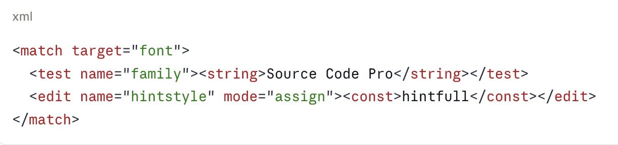
Per-Family Overrides
Some fonts ship with extraordinarily good native hinting. The Liberation family, DejaVu, Microsoft's Cascadia Code and Adobe's Source family fall into this group. For these, hintfull often produces a noticeably crisper result than hintslight. You can apply per-family overrides without affecting the system default.
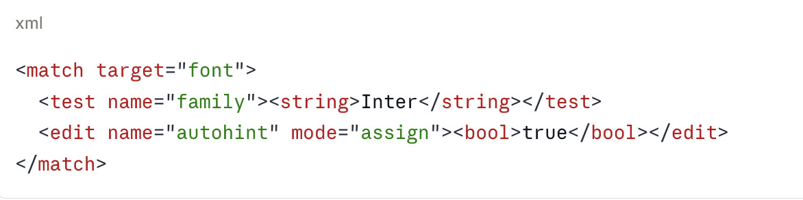
Conversely, modern variable fonts and several commercial typefaces from foundries like Klim and Commercial Type ship with intentionally weak or absent hinting instructions. For these, autohinting often outperforms native hinting.
Inspecting and Comparing in Fontmatrix
Once your fontconfig defaults are in place, Fontmatrix is the cleanest way to verify the result without leaving the desktop. Launch the application and open any font you want to inspect. The preview pane renders the family with the current fontconfig settings applied, which means whatever you see in Fontmatrix is what every well-behaved GTK and Qt application will produce.
Three workflows are especially useful.
The side-by-side comparison view lets you load two or more families and render the same sample text at the same size. This is the fastest way to spot subtle differences in hinting between similar grotesques, or between the original and a substitute.
The glyph table exposes every character in the family at a magnification that makes hinting decisions visible. If you have ever wondered whether a font's lowercase e really aligns to the pixel grid, the glyph table answers the question in one click.
The Panose classification panel reads the metadata embedded in the font and reports the family's proportional, contrast, stroke and serif characteristics. This is the metadata fontconfig uses for substitution, so checking it gives you advance warning when a substitution rule might pick a worse alternate than expected.
Application-Specific Fixes
GTK applications, including all GNOME apps and Firefox by default, honour fontconfig completely. Qt applications, including KDE apps and Telegram, do not on every distribution. If your KDE desktop renders fonts differently from your GNOME desktop on the same machine, the cause is almost always the Qt platform theme.
The fix on Plasma 6 is to install qt6ct and qt6-style-fontconfig, then set the QT_QPA_PLATFORMTHEME environment variable to qt6ct in your shell profile. Qt will then read fontconfig directly and your desktop becomes consistent.
For browsers, Chromium and Chrome require an additional flag because Google bundles its own internal rendering pipeline. Add --enable-features=UseSkiaRenderer --force-color-profile=srgb to the command-line and the browser will render through Skia using the fontconfig settings the rest of the system uses.
Electron applications, which include VS Code, Slack, Discord and a long list of others, generally honour fontconfig if Chromium does. If a specific Electron application renders fonts incorrectly, the workaround is usually the same --enable-features flag applied through its launcher.
Testing Your Configuration
The two-line test that catches almost every misconfiguration is simply to render Lorem Ipsum at fourteen and twenty-four points in three places: a GTK application, a Qt application, and Fontmatrix's preview pane. If all three look the same, your stack is consistent. If they diverge, the toolkit-level overrides described above almost always identify the offender.
For deeper verification, the fc-match command shows the substitution chain fontconfig will apply for a requested family.
fc-match -v "Inter"
The output includes every assigned value for that family, including hint style, antialiasing and subpixel rendering. If fc-match reports values different from what you intended, your overrides are not being read in the order you expected.
A Note on High-DPI Displays
Above approximately 1.5x scaling, the visible difference between hinting modes shrinks dramatically. On a 2x or 3x display, hintnone and hintfull produce nearly identical results because the pixel grid is dense enough that hinting has little to align against. If you are on a high-DPI laptop, the entire hinting argument is less consequential than it appears in tutorials written for 1080p screens. The setting still matters for crispness at very small sizes, but anything above twelve points will look identical regardless.
This is the direction the industry is moving, and the reason Apple long ago abandoned hinting entirely. As Linux displays follow, the value of obsessive fontconfig tuning gradually diminishes. Until that becomes universal, the rules in this guide produce results that are indistinguishable from a well-tuned macOS install on the same hardware, and clearly better than the default on most distributions.
If you are interested in the underlying technology, the Variable Fonts on Linux guide on this site covers a related modern shift, and the How to Choose the Right Font Without Overthinking It post is a companion piece for selecting families that render well in the first place.