How to Choose the Right Font Without Overthinking

Why Choosing a Font Feels Harder Than It Should
Choosing a font is often framed as a creative decision, something intuitive and expressive, yet in practice it quickly turns into one of the most frustrating micro-choices in digital work because it sits at the intersection of taste, function, and overwhelming abundance. What should take minutes expands into an open-ended process, with dozens of tabs, endless comparisons, and a persistent sense that the right option exists somewhere just beyond reach. The issue is not the lack of quality typefaces, but the absence of a decision structure, which forces people to compare instead of decide, and comparison, when options are nearly infinite, inevitably produces hesitation.
The fastest way forward is not to search longer, but to redefine the question itself. Instead of asking which font is best, it becomes far more effective to ask what role the font needs to perform, because once the function is clear, the field of possibilities narrows immediately and decisively.
There Are Only Three Real Use Cases
In most real scenarios, font selection falls into one of three categories: brand expression, content readability, or interface clarity, and each requires a fundamentally different visual behaviour.
When the task is brand, the font operates as a signal rather than a neutral container of text, meaning it must create an impression before it is fully processed. Distinctiveness matters more than invisibility, and subtle characteristics in shape, contrast, or spacing become defining features. This is why many fashion and luxury brands rely on refined serif systems or highly controlled sans-serif typography, where tone is communicated instantly through restraint rather than decoration.
When the focus shifts to content, the logic reverses. The font should disappear into the reading experience, supporting rhythm, flow, and comprehension without drawing attention to itself. Highly expressive fonts often fail here not because they are poorly designed, but because they introduce friction into the cognitive process of reading. What looks repetitive across editorial platforms is, in reality, the result of continuous optimisation for clarity and comfort over time.
Interface design operates under even stricter conditions, where typography becomes part of a decision-making environment shaped by speed and partial attention. The user is scanning, not reading, reacting rather than reflecting, and the font must reduce ambiguity to the absolute minimum. In this context, spacing, weight, and consistency across devices are not aesthetic details but functional requirements, which explains why many digital products converge toward similar typographic solutions.
First Impression Is More Reliable Than Comparison
Once the context is defined, a second principle becomes surprisingly powerful: the first impression is often more accurate than extended comparison. When a font feels right immediately, it usually aligns with an internal expectation already formed by exposure to other visual systems, and this alignment is what ultimately determines whether it works in practice.
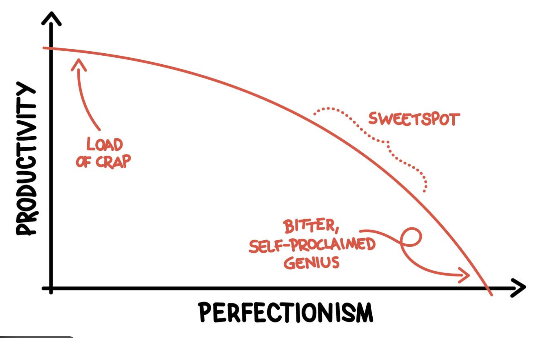
Overthinking begins the moment the decision is delayed, because each additional option introduces doubt rather than clarity. The search for a perfect choice becomes a justification process, where the decision must be explained rather than recognised. In reality, most well-designed fonts within the correct category will perform effectively, and the differences between them are rarely perceived by the end user in any meaningful way.
Why Beginners Get Stuck in the Process
The difficulty many beginners experience is not a lack of taste, but a misinterpretation of the task itself. Font selection is approached as an optimisation problem instead of a contextual decision, leading to excessive comparison across minor variations that have little practical impact. Multiple libraries are opened, subtle differences are analysed, and the process expands far beyond its actual importance.
The paradox is that the more time is invested, the less confident the outcome becomes, because comparison amplifies uncertainty rather than resolving it. What feels like careful consideration is often just a loop without criteria, where every option remains equally plausible and equally unsatisfying.
A more effective approach is to impose limits deliberately by working with a small, trusted set of fonts within each category and reusing them across projects. This does not reduce creative potential, but shifts the focus toward application, where real differentiation occurs through layout, spacing, and composition rather than the typeface itself.
Speed Is a Sign of Clarity
Speed, in this context, is not a compromise but an indicator that the criteria are clear. When a decision is made quickly, it reflects an understanding of purpose, whereas hesitation usually signals that the role of the font has not been properly defined.
Choosing the right font is rarely about discovering something exceptional, but about recognising what is appropriate within a specific context and moving forward without unnecessary friction. The difference between an amateur and a professional is not the ability to navigate thousands of typefaces, but the ability to decide efficiently and consistently.
Once this shift occurs, typography stops being a source of doubt and becomes what it was always meant to be: a precise, almost invisible tool that supports the message without competing with it, working quietly in the background while everything else moves forward.