Comic Sans and the Most Hated Font That Secretly Works
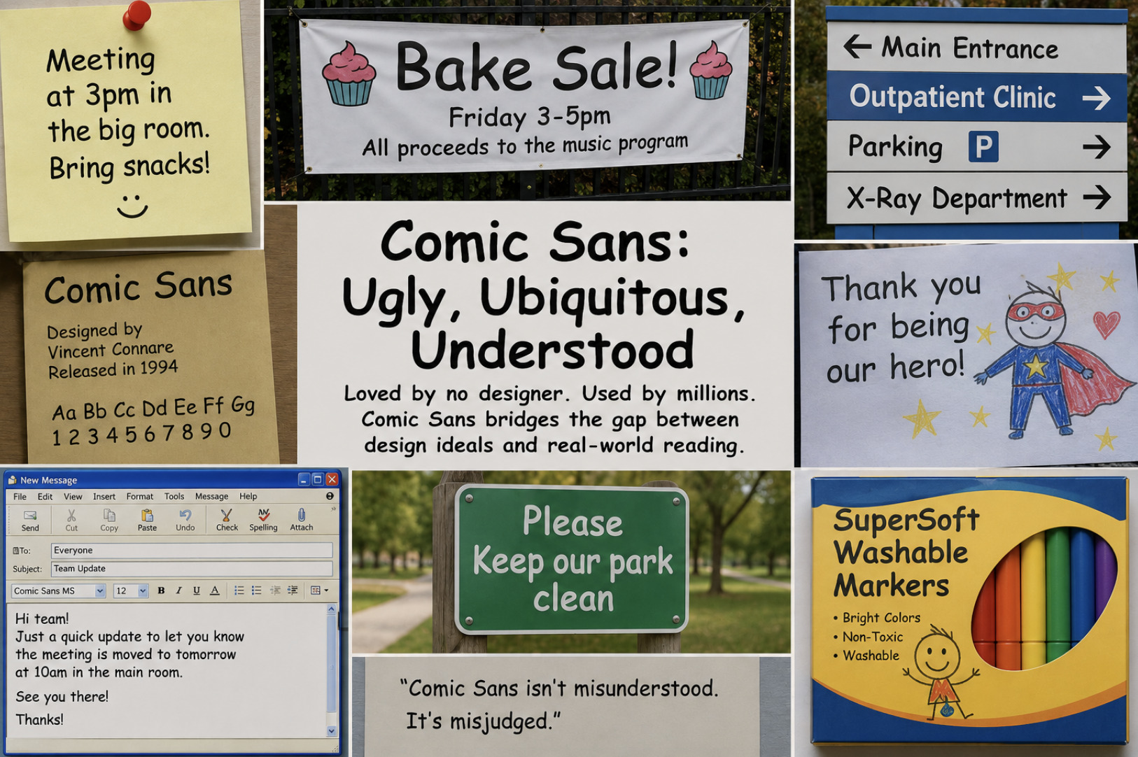
No typeface in history has been mocked as relentlessly as Comic Sans. It has its own hate campaigns, its own ironic fan clubs, and a reputation so toxic among designers that using it is treated as a confession of bad taste. And yet it survives, thrives even, appearing on everything from school newsletters to hospital signs decades after its release. That paradox is worth taking seriously, because the story of Comic Sans is not really about a bad font. It is about the gap between what designers value and what ordinary readers need — and about a typeface that, for all the scorn heaped on it, quietly does a job almost nothing else does as well.
Where the hatred comes from
To understand Comic Sans, you have to understand why designers loathe it, because the contempt is real and not entirely unfair. The font was created to be casual and friendly, modelled loosely on the hand-lettering of comic books, and intended for informal, playful contexts. The problem is that it escaped those contexts almost immediately. It was easy to reach for, came bundled on millions of computers, and so it turned up everywhere — including in serious, formal, and professional settings where its cartoonish informality looked wildly out of place.
That mismatch is the root of the mockery. A font meant for a child's party invitation appearing on a corporate memo, a legal notice, or a gravestone reads as a failure of judgement, and designers, who are trained to match tone to context, find it grating. The hatred, in other words, is less about the letterforms themselves than about their relentless misuse. Comic Sans became a symbol of design carelessness — the font chosen by people who were not thinking about typography at all. For a profession that cares deeply about the right tool for the setting, that is close to unforgivable.
Why it keeps winning anyway
Here is the twist the mockery misses: Comic Sans keeps getting chosen because, for its actual purpose, it works. It was designed to feel approachable and unintimidating, and it succeeds at that better than the polished, "tasteful" alternatives designers would prefer. When the goal is to make something feel warm, human and non-threatening — a note to young children, a friendly community flyer, a sign that should not feel bureaucratic — Comic Sans hits a register that most professional fonts, with their crisp neutrality, simply cannot reach.
This is why it endures despite universal derision. The people reaching for it are often not making a mistake about tone at all; they are correctly sensing that a formal font would feel cold, and choosing warmth instead. A teacher, a nurse, a volunteer organiser wants their message to feel gentle and human, and Comic Sans delivers exactly that impression. The designers sneering at the choice are optimising for sophistication; the person using it is optimising for approachability, and for their audience, approachability is the right call. The font is unfashionable, but it is not wrong.
The accessibility case nobody mentions
There is a further, more serious point that its critics almost never acknowledge, and it flips the whole debate. Comic Sans is genuinely helpful for some readers with dyslexia and related reading difficulties. The very qualities that make it look unpolished — its irregular, slightly uneven letterforms, where similar characters are shaped distinctly rather than mirrored — make individual letters easier to tell apart. Many "elegant" fonts create letters that are near-mirror images of one another, which some readers find confusing; Comic Sans, almost by accident, avoids that trap.
This is not a fringe claim dressed up to defend a joke. Many people with dyslexia report finding it easier to read, and that is a real, functional benefit that the aesthetic mockery completely ignores. It reframes what looks like a badly designed font as an accidentally accessible one — a typeface whose informal irregularity turns out to serve a group of readers that more refined fonts underserve. When accessibility is the priority, the "ugly" font may be the responsible choice, and dismissing it purely on taste means dismissing the readers it helps. The lesson connects to a broader truth about type we touched on in how to make every font render sharply on Linux from the first pixel: legibility is a property you have to actually measure, not assume from how sophisticated something looks.
What Comic Sans teaches about type
Step back from the jokes and Comic Sans becomes one of the most instructive fonts around, precisely because it is so divisive. Its story is a lesson in the difference between good design and appropriate design. It is genuinely poorly suited to formal contexts, and mocking it on a tombstone is fair. But it is genuinely well suited to warmth, informality, and accessibility, and mocking those uses reveals a blind spot in the mockers, not the font. The same object is a mistake in one setting and the correct answer in another — which is true of every typeface, and forgotten about almost none so completely as this one.
So the most hated font in the world secretly works, in the situations it was actually built for and a few it stumbled into by luck. The next time you see it and feel the reflexive wince, it is worth asking who the message is for. If the answer is a child, a nervous patient, or a reader who struggles with conventional type, Comic Sans may be doing its job perfectly while the "better" font would have failed. The font deserves its critics in the boardroom and its defenders in the classroom, and understanding why is a better typography education than any amount of fashionable good taste. For more on matching a typeface to its job rather than its reputation, see our guide on how to choose the right font without overthinking it.
Frequently asked questions
Why do designers hate Comic Sans? Largely because it is misused. It was designed for casual, playful contexts, but it appears constantly in formal and professional settings where its cartoonish informality looks out of place. Designers, trained to match tone to context, see that mismatch as a failure of judgement — so the contempt is more about misuse than the letterforms themselves.
Is Comic Sans actually good for dyslexia? Many readers with dyslexia find it easier to read. Its irregular, distinctly shaped letters — where similar characters are not near-mirror images of each other — make individual letters easier to tell apart, which some readers with dyslexia find genuinely helpful. It is an accidental accessibility benefit its critics rarely mention.
When is it okay to use Comic Sans? When warmth, friendliness and approachability matter more than formality — notes for young children, gentle community materials, or contexts that should not feel bureaucratic — and when accessibility for readers who struggle with conventional type is a priority. It is poorly suited to formal, professional or somber settings.