Why Casino Bonus Ads Use Bold Fonts and Bright Colours
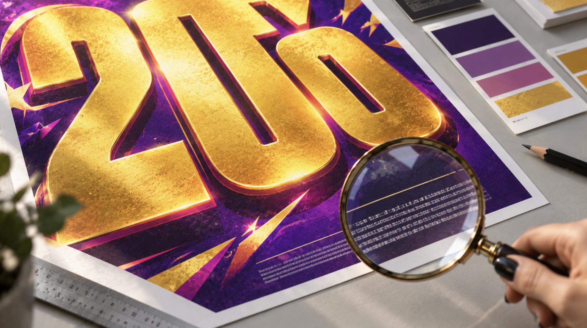
Casino bonus ads use bold fonts and bright colours for one main reason: they need to be noticed quickly, in crowded feeds and on small screens, by people who are not yet paying attention. Heavy type, large numerals and high-contrast colour blocks make the headline offer the first thing the eye lands on. That works for visibility. It also creates a design problem. The same hierarchy that makes a bonus amount impossible to miss can make its conditions easy to overlook.
This article looks at how typography, colour and layout shape the way bonus offers are noticed and understood. It covers why the headline figure dominates, what research says about how much attention smaller text actually receives, and how designers can make terms clear without hiding the offer.
The job of a bonus banner
A promotional banner has a very short window. In a scrolling feed, on a casino lobby page or in an email preview, it competes with everything else on the screen. Designers therefore build it around a single question: what should the viewer see first?
For bonus advertising the answer is almost always the offer itself, usually a number. A percentage, an amount in pounds or a count of free spins becomes the visual centre of the design. Everything else, the brand, the call to action and the conditions, is arranged around it in descending order of size and weight.
This is ordinary visual hierarchy, and it’s used in sale posters, supermarket price tags and news headlines alike. What makes bonus advertising distinctive is the gap between the headline and the information needed to understand it. A sale price is usually complete in itself. A bonus offer usually isn’t, because its practical meaning depends on terms such as wagering requirements, eligible games and time limits.
How font weight creates hierarchy
Weight is one of the most efficient tools in typography for directing attention. A bold or black weight puts more ink, or more lit pixels, into the same space, and the eye registers that density before it reads the words.
In a typical bonus banner you can often see three or four distinct levels:
The offer, set in the heaviest weight and largest size, often in a condensed or display typeface so a long number fits a narrow space.
A short qualifier, such as “welcome bonus” or “on your first deposit”, in a medium weight and much smaller size.
The call to action, often on a button with its own colour, set in a bold weight at a moderate size.
The conditions, in a light or regular weight at the smallest size used in the design, frequently in a low-contrast colour.
Each level is legitimate in isolation. The question is the distance between them. When the offer is many times larger than the conditions and set in a far heavier weight, the design effectively tells the viewer what matters and what can be skipped.
Why numbers get special treatment
Numerals carry the offer, so designers pay particular attention to them. Display typefaces with tall, condensed figures let a large amount occupy the full height of a banner. Lining figures, which sit evenly on the baseline at capital height, look more solid and authoritative than old-style figures, which rise and fall like lowercase letters.
There is also a perceptual effect at work. A number set very large reads as significant before its value has been processed. This isn’t manipulation in itself. It’s how hierarchy works. But it means the size of a figure on screen and its practical value to a player are two completely different things, and typography can widen the gap between them.
What research says about attention to smaller text
The idea that people pay less attention to small print isn’t just an intuition. Eye-tracking studies measure where viewers actually look, and gambling advertising has been studied directly.
In a study published in the Journal of Behavioral Addictions in 2019, researchers led by Lisa Lole tracked the eye movements of 49 regular sports bettors and 10 non-gamblers as they viewed sports-betting advertisements. Participants made significantly fewer fixations on responsible-gambling messages than on the wagering information in the same ads. The authors described those messages as generally inconspicuous. They also reported preliminary evidence that placing them on high-contrast, block-colour backgrounds increased the number of fixations.
That second finding is the useful one for designers. It suggests that the low attention given to secondary messages isn’t fixed. It depends partly on how they’re presented. Text that has the same visual weight as the background is easy to pass over. Text given its own clearly contrasted space is more likely to be looked at.
A much older finding points in the same direction. The isolation effect, described by the psychologist Hedwig von Restorff in 1933, shows that an item which stands out from its surroundings is more likely to be remembered. In advertising, that principle is usually applied to the offer. It could just as easily be applied to the most important condition.
Colour, contrast and the limits of colour psychology
Casino design is often explained with confident statements about colour psychology: red creates excitement, gold suggests luxury, green signals winning. Some of these associations are culturally real. Gold and black are widely read as premium, and red is used across many kinds of retail for sales and urgency. But the evidence that a specific colour reliably changes people’s decisions is much weaker than popular articles suggest. Findings in this area have been mixed, often depend on context, and don’t support claims that a particular colour automatically makes people gamble.
What is well established is the effect of contrast. The eye is drawn to areas of strong difference in brightness and colour. A bright yellow figure on a deep purple background, or white text on a saturated red button, stands out because of the contrast between foreground and background, whatever the colours mean.
That gives colour two very different roles in a bonus advert:
Salience. Bright, saturated colour and strong contrast make the headline offer and the action button visible from across a screen.
Legibility. The contrast between text and its background determines whether smaller text can be read comfortably at all.
These two roles are often in tension. Mid-grey conditions placed over a busy, colourful background can technically be present on the banner and still be hard to read. The same text on a plain, high-contrast strip would be read far more easily, even at the same size.
What accessibility standards require
The Web Content Accessibility Guidelines (WCAG), published by the W3C and now at version 2.2, set measurable minimums for text contrast. At Level AA, normal text needs a contrast ratio of at least 4.5:1 against its background. Large text needs at least 3:1, where large means roughly 18 points, or 14 points in bold. Small, light-weight conditions in pale grey on a coloured background often fall below the 4.5:1 threshold, while the bold headline above them passes easily.
The guidelines matter beyond legal compliance. They describe the conditions under which people with low vision, people using screens in bright daylight and people viewing on older displays can read text at all. A promotion whose terms fail contrast requirements is effectively presenting them to fewer readers.
Promotional cards inside casino interfaces
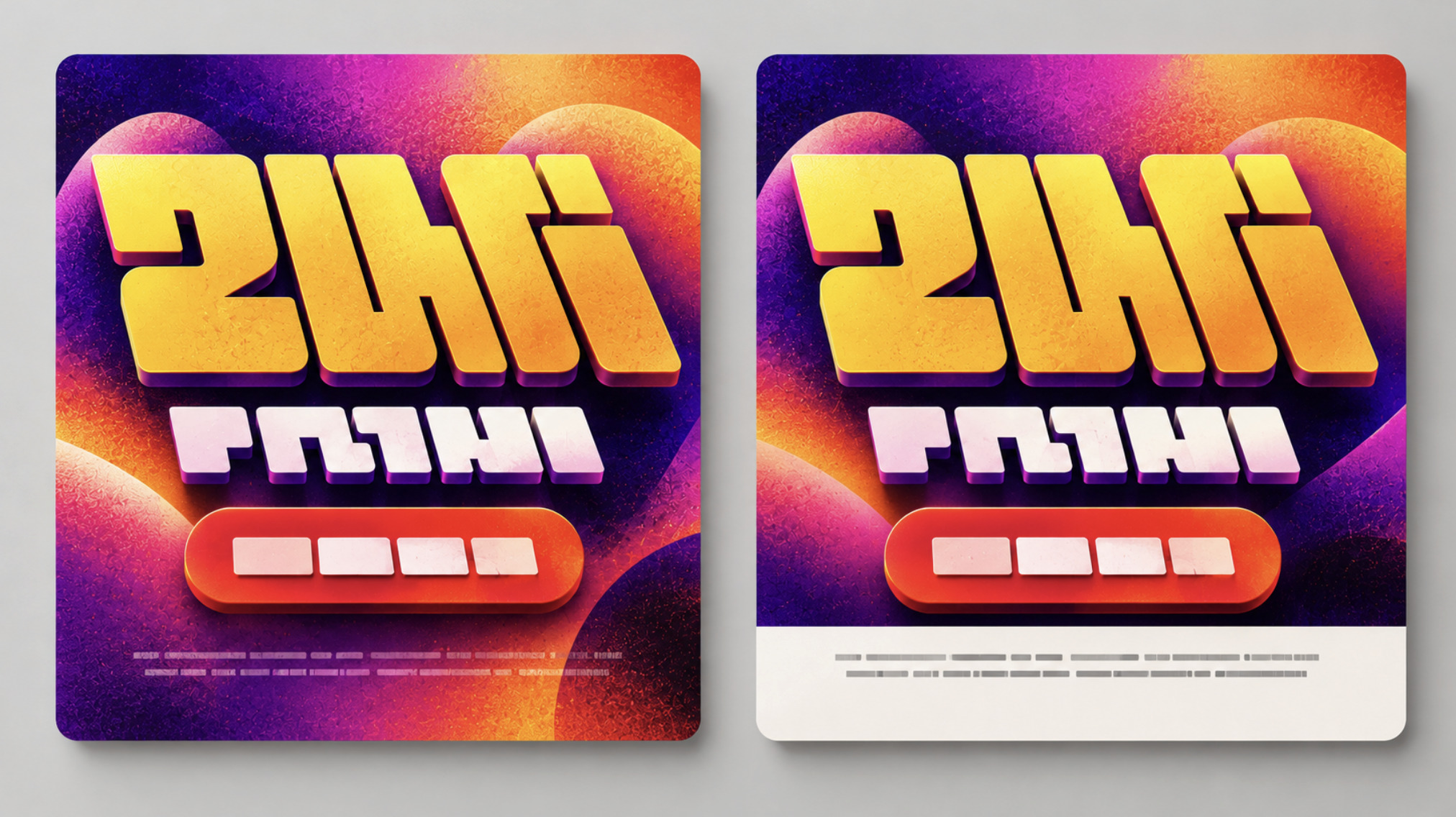
Bonus design isn’t limited to external adverts. Inside casino lobbies, offers usually appear as promotional cards: rectangular tiles combining an image, a headline, a button and a line of conditions. They are designed to be scanned in a grid or a horizontal carousel, often alongside game thumbnails.
The card format adds two constraints.
Space is tight. A card may be only a few hundred pixels wide, and the headline usually takes most of it. Conditions get a single line, often truncated, with the full terms placed behind a link or an information icon.
Cards are viewed in motion. Carousels rotate automatically or are swiped through quickly, so each card may be seen for only a moment. Large headline type survives that. A single line of small text is much less likely to be read.
In the UK, the advertising codes administered by the Advertising Standards Authority require promotional marketing to clearly and prominently communicate all significant conditions where leaving them out is likely to mislead. For gambling promotions, the ASA’s guidance gives examples such as eligibility restrictions, deposit or wagering requirements, time limits and minimum odds or bet types. It also says links to full terms should be clear and prominent, not hidden in footers or small print. The ASA has ruled against ads in which important exclusions were set in small print that was easy for consumers to overlook. The rules don’t prohibit visual hierarchy. They require the significant information to remain genuinely noticeable within it.
Typography on mobile screens
Most online casino promotions are now seen on phones, and mobile screens change how hierarchy behaves.
A banner designed at desktop width and then scaled down shrinks everything proportionally. The headline remains large enough to read, but conditions that were already small can drop below a comfortable reading size. Light weights suffer most, because thin strokes become faint and break up on lower-resolution displays.
Responsive layouts can avoid this by treating the conditions as text in their own right rather than as part of an image. Live text can reflow into extra lines, respond to the user’s own text-size settings and remain readable by screen readers. WCAG includes requirements here too. Text should be resizable up to 200% without loss of content, and content should reflow to a 320-pixel width without horizontal scrolling. A condition that exists only as pixels inside a banner image can’t do any of this.
Mobile also changes reading behaviour. People scroll quickly and often hold the phone at arm’s length or in bright light. Typefaces with open shapes, a generous x-height and clearly distinguished characters hold up better at small sizes than condensed display faces, which are excellent for headlines but poor for running text.
Noticeable is not the same as understandable
The central distinction in bonus design is between making an offer noticeable and making its conditions understandable. Both are design goals, and both can be achieved at the same time. They simply require different tools.
Noticeability depends on size, weight, contrast and position. Understanding depends on legibility, proximity, plain language and enough time to read. A banner can excel at the first and fail at the second without containing a single false statement.
Brand identity adds another layer. Casino brands tend to build recognisable visual systems from logos, colour palettes and display typefaces, and promotions are usually designed to fit within them. Whether a reader is looking at an offer from a well-known operator or a smaller one such as tiffany luck casino, the useful habit is the same: treat the large figure as the start of the information, not the whole of it, and look for the conditions that give it its real meaning.
How responsible design can make terms clearer
None of this requires bonus advertising to become dull. Designers have several ways to keep the offer prominent while making its key conditions much harder to miss.
Put the most important condition near the headline
Proximity tells the eye that two pieces of information belong together. A wagering requirement or time limit placed directly under the headline figure is read as part of the offer. The same information placed at the bottom of a banner, after the call to action, is read as an afterthought.
Narrow the gap in hierarchy
The conditions don’t need to match the headline, but they shouldn’t sit several levels below everything else either. Using a regular weight instead of a light one, increasing the size modestly and giving the line its own space all improve legibility without changing the overall composition.
Give conditions their own contrast
As the eye-tracking research suggests, a plain high-contrast strip or block behind key terms can make them more likely to be noticed. Meeting the WCAG contrast minimum is a sensible baseline, and exceeding it is better.
Use readable typefaces for small text
Display faces belong in the headline. Conditions should use a typeface designed for small sizes, with open counters, a reasonably large x-height and distinct letterforms, so that figures such as 1, 7 and 0 can’t be confused.
Write conditions in plain language
Typography can’t fix unclear wording. Short sentences, familiar words and specific figures, such as “Bonus expires in 7 days” rather than “Time restrictions apply”, make conditions faster to read and easier to understand.
Keep terms as live text
On websites and in apps, setting conditions as real text, not as part of an image, lets them respond to accessibility settings, reflow on small screens and be read by assistive technology.
What this means for readers
For designers, bonus advertising is a clear case study in how hierarchy shapes understanding. The visual tools that make an offer visible are well understood. The challenge is applying them to the information people need, not only to the information that sells.
For readers, the practical lesson is simpler. The biggest, boldest element of a promotion is designed to be seen first, not necessarily to be the most important. When the headline number is the only thing you notice, it’s worth looking for the line of smaller text near it, and reading it before deciding whether an offer is relevant to you.