Serif vs Sans-Serif and the Readability Myth That Won't Die
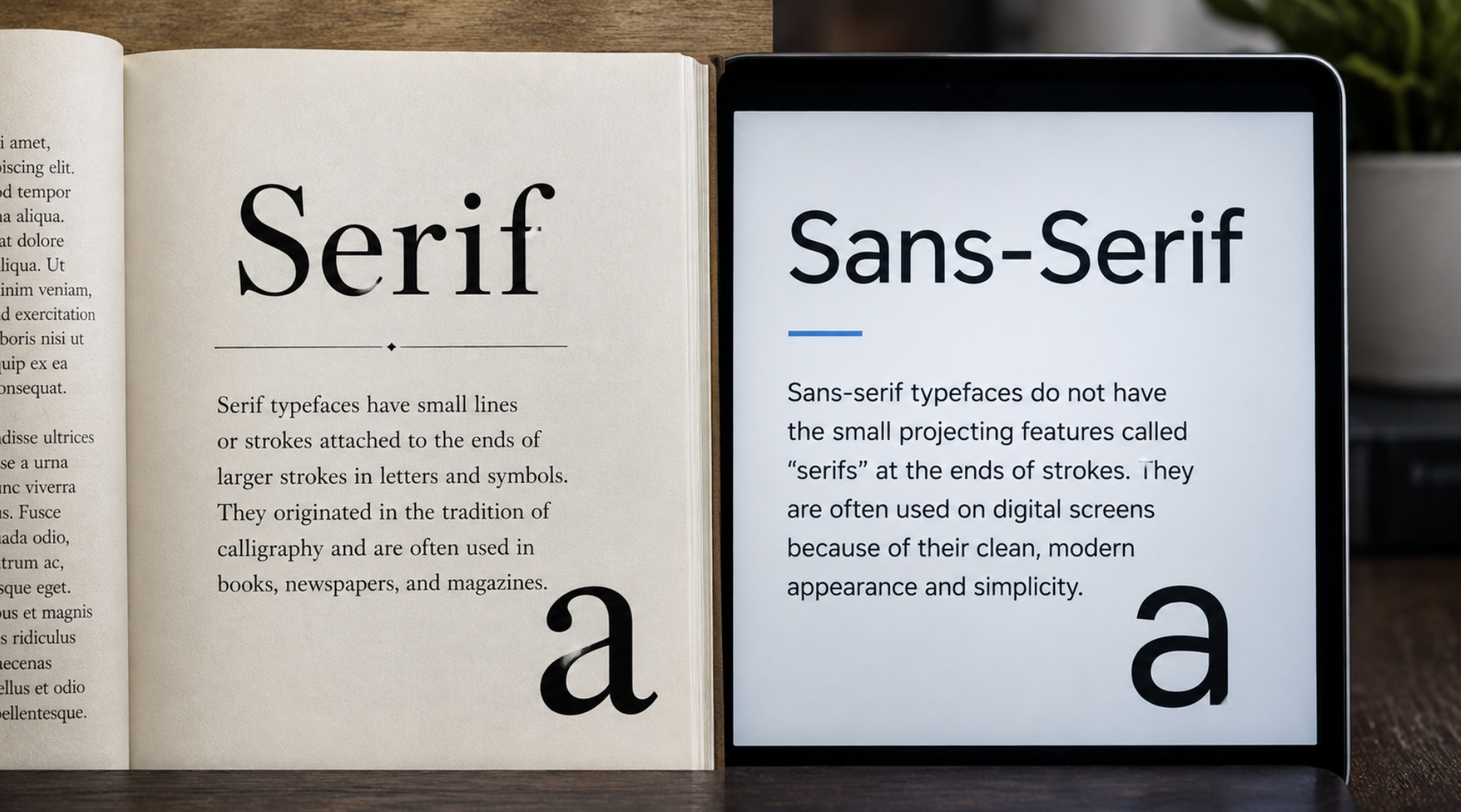
Almost everyone who has ever chosen a font has heard the rule. Serif fonts — the ones with little feet on the letters — are easier to read in print, the wisdom goes, while sans-serif fonts, the clean ones without the feet, are easier to read on screens. It is repeated in design classes, in blog posts, in office style guides, stated with the confidence of settled fact. It is also, for the most part, a myth. The truth about serif versus sans-serif is more interesting, more useful, and considerably less tidy than the rule suggests, and untangling it will make you better at choosing type than any memorised slogan ever could. Let us take the claim apart piece by piece.
The claim, stated fairly
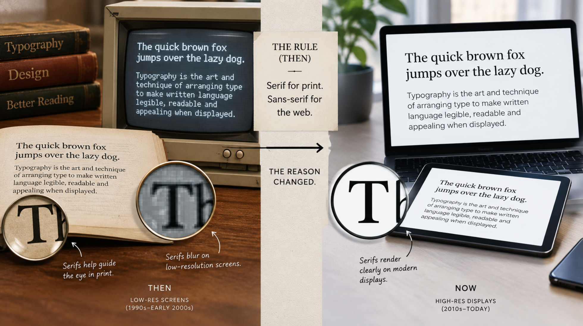
To debunk something honestly you first have to state it in its strongest form, so here it is. The traditional belief holds two things: that serifs actively aid reading in printed body text, with the little strokes helping guide the eye along the line and distinguish letters, and that on screens serifs become a liability, because low-resolution displays render those fine details poorly, so clean sans-serif shapes read more clearly. From this comes the familiar prescription: serif for print, sans-serif for the web. It sounds plausible, it has a mechanism behind it, and it is repeated constantly. Plausibility, mechanism, and repetition are exactly how a myth earns its authority.
The claim is not pure invention — it grew from something that was once partly true, which is why it has been so hard to kill. There was a period when it contained a real kernel, and understanding that kernel is the key to understanding why the rule is now largely obsolete. A rule can be entirely reasonable in the conditions that produced it and completely wrong once those conditions change, and that is precisely what happened here.
Where the myth came from — and why it expired
The screen half of the rule has a genuine origin: early, low-resolution displays. In the era of chunky pixels, screens simply could not render fine detail well, and the delicate strokes of serifs — thin lines, small feet, subtle variations — turned to mush at small sizes, becoming blurry and harder to read than the bolder, simpler shapes of a sans-serif. On those screens, the advice to prefer sans-serif for on-screen text was real, practical guidance, because the technology genuinely could not do serifs justice. The rule was true, for its time.
That time has passed. Modern displays are high-resolution to the point where they render fine detail beautifully, reproducing the thin strokes and delicate feet of a serif face as crisply as any printed page. The technological limitation that justified "sans-serif for screens" has essentially vanished on contemporary devices, which means the reason for the rule has evaporated even as the rule itself lives on out of habit. This is the crucial move in the whole debate: the screen-based half of the wisdom was a response to a hardware constraint, and the constraint is gone. Repeating the advice today is like insisting on a workaround for a bug that was fixed years ago.
What the research actually shows
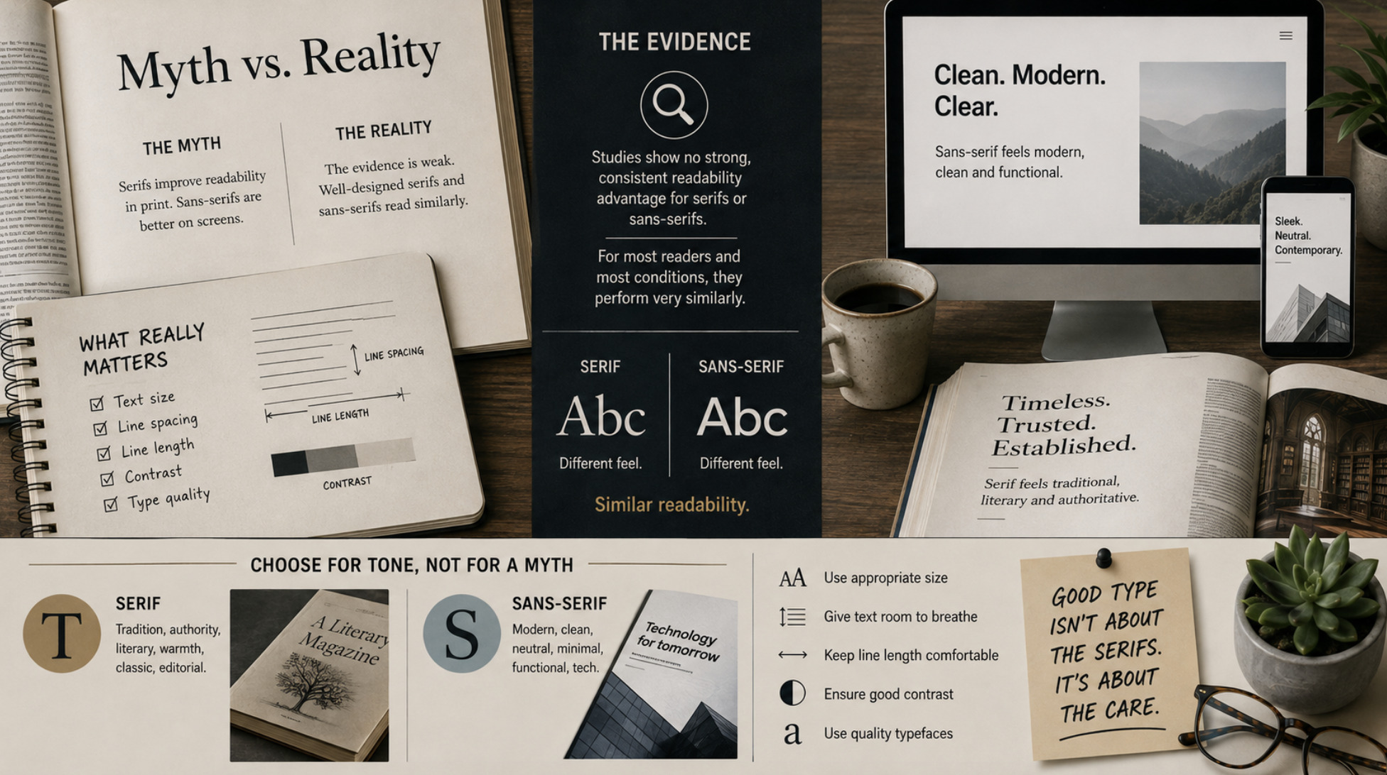
If serifs do not help on old screens anymore, do they at least help in print, as the other half of the rule claims? Here the honest answer is the one people find least satisfying: the evidence that serifs meaningfully improve readability, in print or anywhere else, is weak and inconsistent. Despite the confidence with which the rule is stated, studies attempting to show a clear readability advantage for one style over the other have largely failed to find a strong, consistent effect. The dramatic difference the myth implies simply does not show up when it is actually measured. For continuous reading by a competent reader, a well-designed serif and a well-designed sans-serif perform far more similarly than the folklore suggests.
This is the part that surprises people, because the rule feels so obviously true. But "feels true" and "is measurably true" are different things, and much of the serif-versus-sans certainty belongs to the first category. The little feet neither meaningfully speed the eye along a line nor meaningfully slow it down for most readers in most conditions. What this means is not that the two styles are identical — they clearly look and feel different — but that the specific claim at the heart of the myth, that one is inherently easier to read than the other in a given medium, is not well supported. The debate has been fought over a difference that, in terms of raw readability, is far smaller than everyone assumes.
What actually determines readability
If the serif/sans distinction is not the deciding factor, something must be, and it is worth knowing what. Readability is determined far more by the quality and setting of the type than by whether it has serifs. A well-designed typeface of either kind, set well, will read beautifully; a poorly designed or poorly set one will read badly regardless of its serifs. The factors that genuinely matter are the ones the myth distracts from: the size of the text, the spacing between lines, the length of each line, the contrast between text and background, and whether the typeface itself is well-drawn with clear, distinguishable letters. Get those right and the reader will be comfortable; get them wrong and no amount of serif-or-sans wisdom will save you.
This reframes the whole question in a much more useful way. Instead of agonising over serif versus sans as though it were the key decision, the practical designer focuses on the things that actually affect whether text is comfortable to read — appropriate size, generous spacing, sensible line length, good contrast, and a quality typeface. The serif/sans choice then becomes what it really is: primarily an aesthetic and tonal decision rather than a readability one. It is the same shift from folklore to fundamentals that we encouraged in how to choose the right font without overthinking it, and it is liberating, because it moves the choice away from a false rule and toward the things you can actually control.
Choosing for tone, not for a myth
So how should you actually decide between a serif and a sans-serif? Once readability is off the table as the deciding factor, the choice becomes about character and context. Serifs tend to carry connotations of tradition, formality, authority and a certain literary warmth — they feel established, editorial, book-like. Sans-serifs tend to feel modern, clean, neutral and functional. Neither association is a law, and plenty of typefaces play against type, but these tonal qualities are real and are the sensible basis for choosing: pick the style whose feeling suits the content and the context, not the one a discredited rule tells you is more legible.
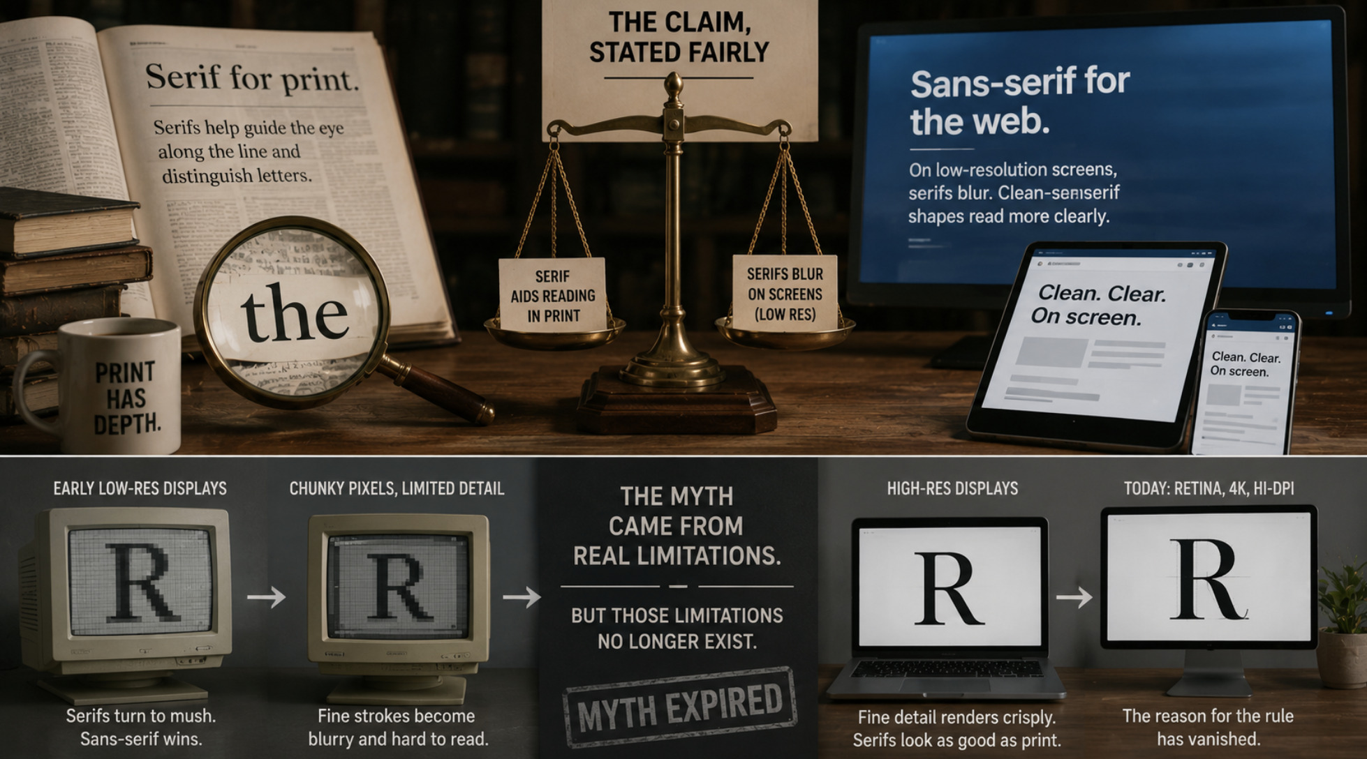
This is a far better way to work, because it is honest about what the decision actually is. Choosing a serif for a literary magazine or a sans-serif for a tech product is a reasonable expression of tone, and rendering matters too — on any given platform you still want the typeface to display crisply, a craft we covered in how to make every font render sharply from the first pixel. What you should not do is choose based on the tired claim that one is inherently easier to read in a given medium, because that claim rests on a hardware limitation that no longer exists and a readability difference that was never well supported. Free yourself from the myth, attend to the things that genuinely affect reading, and choose the style whose character fits — that is the whole of good type selection, and it is a great deal simpler and truer than the rule everyone repeats.
The myth, retired
The serif-versus-sans readability rule is a perfect example of how a piece of design folklore outlives the conditions that made it true. It was born from a real screen limitation, generalised into a universal law, propped up by a print claim the evidence never really supported, and repeated so often that it acquired the authority of fact. Modern screens dissolved the screen half; measurement dissolved the print half; and what remains is a distinction that is real and meaningful aesthetically but far less consequential for readability than everyone believes.
For anyone who chooses type — which, increasingly, is almost everyone — the practical liberation is to stop treating serif versus sans as a readability decision at all. Choose for tone. Attend to size, spacing, line length, contrast and typeface quality, which are what actually make text comfortable to read. And retire, gently but firmly, the rule about feet on letters and which medium they belong to. It served its era. Its era is over. Good typography was never really about the serifs; it was always about the care, and that has not changed at all.