JetBrains Mono and the Problem Every Coding Font Is Trying to Solve

Every monospace font in active use is an answer to the same question. The question is: what does code actually need from a typeface that running text does not?
The answers are specific. Code must remain aligned at every line regardless of content. Characters that look visually similar in reading contexts — zero and capital O, one and lowercase L and capital I — must be immediately distinguishable at small sizes and under the cognitive load of active debugging. The font must remain legible at 11 or 12 pixels, where many developers run their terminals, without becoming either too light to read or too heavy to sustain over hours. It must handle the full range of punctuation and symbol characters that programming languages depend on — braces, arrows, pipe characters, comparison operators — with the same clarity it applies to letters.
These are not aesthetic requirements. They are functional requirements that determine whether a developer misreads a variable name, loses track of indentation level, or correctly identifies a boundary condition at a glance. JetBrains Mono, released by JetBrains in 2020 and available under the SIL Open Font License, is the coding font that has done the most deliberate work on each of these requirements — and the reasons it has become the most recommended free coding font in 2026 are technical before they are aesthetic.
The X-Height Decision
The most consequential design decision in JetBrains Mono is one most users will not consciously register: the x-height ratio.
X-height is the height of lowercase letters relative to capital letters. JetBrains Mono uses an x-height ratio of approximately 1.32 — meaning its lowercase letters are tall relative to its capitals. This is not a subtle choice. It directly affects how much visual information each character occupies on screen.
The mechanism is straightforward. A taller x-height means lowercase letters occupy more pixels at any given font size. More pixels per character means more differentiation between adjacent letterforms, which means fewer reading errors in dense code at small sizes. The developer running their editor at 12px on a 96 DPI monitor is working with very few pixels per character. JetBrains Mono extracts more useful information from those pixels than a font with a lower x-height, because more of each character's area is filled with distinguishing information rather than empty space.
This is measurable in practice. In blind testing comparisons across editors, developers consistently rate JetBrains Mono highest for legibility over extended sessions of six hours or more. The x-height ratio is the primary structural reason for that result. It is not a style preference — it is an engineering decision about information density.
The tradeoff is that the tall lowercase gives JetBrains Mono a distinctive look that some developers find visually heavy compared to more traditional coding fonts like Source Code Pro or DejaVu Sans Mono. Both responses are legitimate: the design optimises for function over visual lightness. If you find the font feels dense, that density is doing useful work.
Character Disambiguation: the Three Pairs
Every serious coding font documentation discusses character disambiguation. JetBrains Mono's solutions for the two most critical pairs are worth examining specifically because the design choices differ from how other fonts handle the same problem.
Zero vs capital O: JetBrains Mono uses a slashed zero — a diagonal stroke through the zero's interior. This is a conventional solution and a correct one. The slash is visible at small sizes in a way that dotted or empty zeros are not, and it creates an unambiguous visual distinction from the capital O in all rendering contexts. Fontmatrix users inspecting the glyph in the comparison panel will see the diagonal clearly even at display sizes well below the minimum recommended for body text.
Capital I vs lowercase L vs numeral 1: This is the harder disambiguation problem, and JetBrains Mono's approach is more unusual. The capital I is given horizontal serifs — short horizontal bars at the top and bottom of the vertical stroke — even though the rest of the font is sans-serif. The numeral 1 has a diagonal flag stroke at the upper left. The lowercase l has a curved tail at the baseline. Three characters, three distinct shapes, each identifiable without context.
This hybrid serif approach for I specifically is typographically interesting and slightly controversial. JetBrains Mono is not a serif font. Introducing serifs on a single character violates formal consistency in exchange for functional disambiguation. The argument for the choice is that functional disambiguation in code contexts is more valuable than formal consistency. The argument against is that the capital I's serifs can look incongruous at display sizes, though at the 11-14px range where most code is read they are invisible as serifs and simply register as a visually distinct shape.
Fontmatrix's side-by-side comparison view allows direct inspection of these characters against competing monospace fonts at identical sizes. The disambiguation contrast between JetBrains Mono and a font like DejaVu Sans Mono is visible immediately in the comparison panel on any of the confusable character pairs.
Programming Ligatures: What They Do and Why You Might Not Want Them
JetBrains Mono includes 139 programming ligatures. Understanding what they are and what they actually do clarifies both why they are popular and why a significant minority of experienced developers disable them immediately.
Programming ligatures are OpenType substitutions that replace specific character sequences with single compound glyphs. The most common examples:
->renders as an arrow with a combined shaft and head=>renders as a double-line arrow!=renders as a crossed-out equals sign (similar to ≠)===renders as a triple-line equals<=and>=render as mathematical inequality symbols
The case for ligatures is that they reduce visual noise in operator-heavy code. A line containing multiple -> sequences reads more cleanly when each is a single unambiguous arrow glyph rather than two separate characters that the eye must combine while reading.
The case against is that ligatures create a disconnect between what the code actually contains and what you see on screen. A != rendered as a ≠ symbol is not a ≠ symbol — it is an exclamation mark followed by an equals sign. In pair programming, code review, and any situation where someone is reading code aloud or describing it verbally, this disconnect creates friction. Matthew Butterick's argument in Practical Typography against programming ligatures is essentially this: code is a text that must be read both by the eye and by the mind simultaneously tracking the actual character sequence, and ligatures optimise for one at the expense of the other.
Both positions have merit. JetBrains Mono includes a separate distribution for editors that do not support OpenType features — JetBrains Mono NL — which is identical in all metrics and design but ships without ligature substitutions. Linux users who prefer to manage ligatures explicitly through fontconfig can install JetBrains Mono NL and are guaranteed to see individual characters regardless of application rendering support.
Installing and Using JetBrains Mono on Linux
The font is available under the SIL Open Font License, which permits use in commercial and personal contexts and redistribution without modification.
Package manager installation (recommended):
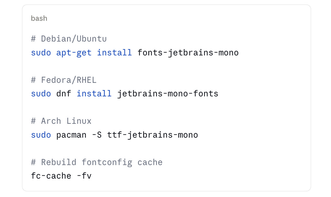
Verification:
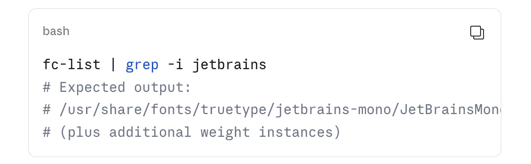
Variable font axis: JetBrains Mono is a variable font with a single weight axis (wght) spanning 100 to 800. Applications that support variable fonts — including modern terminals like Kitty and Alacritty, and editors running on a Wayland stack — can access the continuous weight range rather than fixed instances. The practical implication for terminal use: specifying font-weight: 450 in Kitty's configuration gives you a weight between Regular (400) and Medium (500) that many users find optimal for long sessions.
In Fontmatrix: The variable font loads with the default instance visible in the preview panel. The metadata inspector shows the wght axis range. Comparison view allows side-by-side inspection with Fira Code, Source Code Pro, or any other loaded monospace font. The Panose classification data is present in the font's name table and surfaces in Fontmatrix's classification view.
JetBrains Mono vs the Competition
The coding font landscape on Linux in 2026 has several strong free options. The relevant distinctions:
vs Fira Code: Fira Code pioneered programming ligatures in the modern coding font era and has a more extensive ligature set in some respects. Its x-height is lower than JetBrains Mono, which makes it feel more visually traditional but less information-dense at small sizes. Blind legibility testing consistently favours JetBrains Mono for extended sessions.
vs Source Code Pro: Adobe's Source Code Pro has no programming ligatures, a wider weight range (7 named weights), and a more neutral character that many developers prefer precisely because it has less visual personality. Strong choice for developers who want character discrimination without the distinctive look that JetBrains Mono's hybrid-serif I produces.
vs DejaVu Sans Mono: Pre-installed on most Linux distributions and has broad Unicode coverage including mathematical symbols, box-drawing characters, and phonetic alphabets that JetBrains Mono does not match. For terminal work involving Unicode-heavy output, DejaVu's coverage advantage is real. For general development, JetBrains Mono's legibility and disambiguation advantages outweigh DejaVu's coverage breadth.
vs Cascadia Code: Microsoft's Cascadia Code is the direct competitor in terms of design philosophy — also designed for developer environments, also includes programming ligatures, also available under OFL. Cascadia's character has more geometric influences; JetBrains Mono is somewhat warmer. Both are strong; the choice is primarily aesthetic at this level.
The decision tree for most Linux developers: if you want the maximum legibility at 11-13px with good disambiguation and are comfortable with optional ligatures, JetBrains Mono is the correct choice. If you want zero ligatures and maximum neutrality, Source Code Pro. If you need Unicode breadth and are already using the system default, DejaVu Sans Mono is fine. If you want the most extensive ligature set specifically, Fira Code.