IBM Plex and the Typeface That Freed IBM From Helvetica
For more than half a century, one of the most recognizable companies on earth dressed itself almost entirely in someone else's clothes. IBM — a firm whose own credo, courtesy of designer Paul Rand, was that good design is good business — set nearly all of its type in Helvetica. It was a sensible, even admirable choice for decades. It was also, by the 2010s, an oddity: the company that helped invent modern computing had no voice of its own on the page. In 2017 that changed, and the way it changed is one of the more quietly radical stories in corporate type.
The font that replaced Helvetica is called IBM Plex, and the most interesting decisions about it have nothing to do with serifs. They have to do with ownership, with openness, and with what a technology company actually wants its letters to say.
Fifty years of borrowed letters
The setup is almost funny once you see it. By the mid-2010s, IBM was paying licensing fees, year after year, to use a Swiss typeface from 1957 across a global brand. Helvetica is a magnificent piece of design, but it is also everyone's — it belongs to no era and no company, which is exactly the problem when you are trying to look like yourself and not like an airport sign.
The argument inside IBM, as its design leadership later described it, was blunt: why does a company of this scale and history not have a typeface of its own? Helvetica was the product of a particular mid-century modernism, and that moment had passed. So in 2015 IBM brought in Mike Abbink — a designer who had previously created a bespoke face for GE — and partnered with the independent Dutch foundry Bold Monday, where Paul van der Laan and Pieter van Rosmalen led the actual drawing. The brief was to build something that was unmistakably IBM, and then, in the move that makes the whole project worth writing about, to give it away.
"Man and machine," drawn into the letters
The concept the team kept returning to was the meeting point of the human and the engineered — a fitting idea for IBM, and one you can actually see in the glyphs if you know where to look.
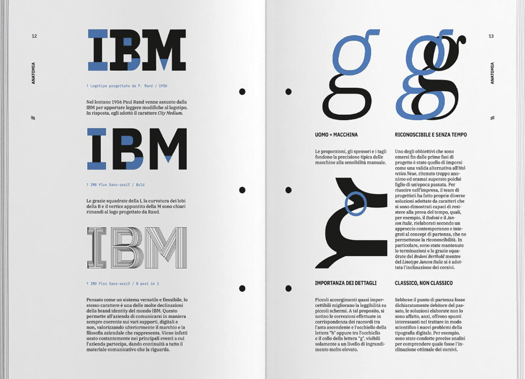
The sans-serif, IBM Plex Sans, is a grotesque drawn with deliberate restraint. The team explicitly rejected the alternatives as carrying the wrong message: humanist sans-serifs felt too soft, geometric ones too sterile and inefficient, and neo-grotesques too clinically perfected. They reached instead toward Franklin Gothic, borrowing details like its angled terminals, the two-storey g, and the little horizontal foot on the numeral 1. The result reads as confident and slightly mechanical without tipping into coldness. Look closer and the references get specific: the squared-off counters echo the square negative spaces inside the B of the old IBM logotype. The brand's history is literally folded into the letterforms.
IBM Plex Serif descends from a different lineage — a transitional serif drawing on Bodoni, the typeface Paul Rand favored in his legendary work for IBM, with ball terminals and crisp rectangular serifs. And IBM Plex Mono, the one most likely to interest the readers of this site, gets its italic from the IBM Selectric typewriter's Italic 12 face — a direct nod to the machines that once put IBM's letters on paper. Together with a Condensed cut, these form a true superfamily: one coherent voice across sans, serif, condensed and monospace, each in eight weights with genuine italics, and language coverage that has grown to span well over a hundred writing systems.
The decision that actually mattered: open source
Plenty of big companies commission a custom typeface. Almost none of them then release it, for free, to the entire world. IBM did, publishing Plex under the SIL Open Font License 1.1 — the same permissive license that anchors most of the modern open-font ecosystem.
This is the part worth dwelling on, because it is so unusual. A corporate identity typeface is normally a jealously guarded asset; releasing it open source means anyone — a student, a competitor, a Linux distro, you — can use, embed, modify and redistribute it at no cost, for commercial work included. IBM's stated ambition was even bigger than generosity: they wanted Plex to become a standard operating-system typeface, something that ships and lives at the level of system defaults. Given Rand's "good design is good business," open-sourcing the face was less a charitable afterthought than the logical extension of the philosophy. A typeface that everyone can use is a typeface that travels — and travelling is exactly what a brand voice is supposed to do.
Why Linux users should care
If you run an open desktop, Plex is one of the easiest high-quality wins available to you. It is free in every sense that matters, it is OFL-licensed so there are no usage worries (see our companion guide on font licensing if you want the details), and it was engineered to operating-system standards rather than as a one-off display gimmick.
The practical sweet spot is IBM Plex Mono for code and the terminal. It sits in the same conversation as the other serious open coding faces — it is humane and readable at small sizes, with a steady rhythm that holds up over long sessions, and its typewriter-derived italic gives comments a quiet character that few monospaces bother with. Whether it beats your current coding font is the kind of thing you should decide by looking, not by reading: install the family, open it in Fontmatrix beside your present favorite, and compare the lowercase a, g, the numerals, and the distinction between similar glyphs like 1/l/I and 0/O at your actual editor size. That side-by-side glyph comparison is exactly the job Fontmatrix exists for — and Plex is one of the most rewarding families to run it on, because the four members are clearly siblings yet each has a distinct job.
A typeface that started life solving an internal branding problem for one enormous company ended up as a genuinely common good. That is a rare arc in type design, and it is the reason IBM Plex deserves a place in your font library — not because it replaced Helvetica, but because of how it did it.
Frequently asked questions
Is IBM Plex free to use?
Yes. IBM Plex is released under the SIL Open Font License 1.1, which makes it free for both personal and commercial use, including web embedding, app bundling, and modification. You can download the full family from IBM's type resources or install it from most Linux distributions' package repositories.
What fonts are in the IBM Plex family?
IBM Plex is a superfamily comprising IBM Plex Sans, IBM Plex Serif, IBM Plex Mono, and IBM Plex Sans Condensed, each available in eight weights with true italics. It covers more than a hundred writing systems, making it unusually versatile for multilingual projects.
Why did IBM stop using Helvetica?
IBM had used Helvetica for over fifty years but had no typeface of its own, while paying ongoing licensing fees. In 2017 it introduced IBM Plex, a bespoke open-source typeface, to give the company a distinctive voice and free it from those license payments — a decision rooted in IBM's long-standing belief that good design is good business.
Is IBM Plex Mono a good coding font?
It is a strong choice. IBM Plex Mono is highly legible at small sizes, has a steady rhythm suited to long coding sessions, and offers clear distinction between easily confused glyphs. Its italic, derived from the IBM Selectric typewriter, gives comments and emphasis a distinctive look. The best way to judge it is to compare it directly against your current coding font.
Who designed IBM Plex?
IBM Plex was conceived under the creative direction of Mike Abbink at IBM and drawn in collaboration with the Dutch foundry Bold Monday, with type design led by Paul van der Laan and Pieter van Rosmalen, alongside specialists for its many non-Latin scripts.