How to Pair Fonts on Linux — Three Rules and Eight Combinations That Actually Work

Font pairing is the decision that most designers make too quickly and most developers make not at all. The typical approach — pick a font for headings, pick a different font for body text, assume they work together — produces combinations that are inoffensive but not interesting, or occasionally combinations that actively work against each other without the designer quite knowing why.
The underlying principles are not complicated. They distil to three rules that operate in sequence: contrast between classifications, shared mood, and defined hierarchy. Every successful font pairing satisfies all three. Every combination that feels vaguely wrong violates at least one.
This guide applies those rules to fonts available on Linux, with specific examples using typefaces accessible through package managers or Google Fonts, and fontconfig configurations for implementing each pairing in practice.
Rule 1: Contrast Between Classifications
The most fundamental rule of font pairing is that the two typefaces must be visually distinct. This sounds obvious until you consider how often it is violated.
The specific failure mode is pairing two fonts from the same subfamily — two geometric sans-serifs, two transitional serifs, two humanist sans-serifs — without any meaningful visual differentiation between them. The reader cannot tell which element is more important. The layout feels flat. The two fonts look like an accident rather than a decision.
The contrast does not need to be extreme. A serif paired with a sans-serif is the reliable standard because the structural difference between the two classifications is immediately legible — serifs have small horizontal strokes extending from the ends of letterforms; sans-serifs do not. This is a visible, scale-independent distinction that communicates hierarchy even when size is held constant.
Two sans-serif fonts can be paired successfully, but only when the contrast comes from a different axis: one geometric and one humanist, or one condensed and one regular-width, or one very heavy and one very light. The key is that the contrast must be obvious, not subtle. Typography that almost looks intentional is worse than typography that looks accidental — it reads as a mistake trying to look like a decision.
The fontmatrix test: Load both fonts into the comparison panel. Reduce the size until both are at approximately 14px. If you cannot distinguish which is which within two seconds, the combination will not produce readable hierarchy in use. If they are immediately distinct, proceed to Rule 2.
Rule 2: Shared Mood
Contrast is necessary but insufficient. Two fonts can be visually distinct and still look wrong together because they communicate different things.
A high-contrast display serif designed for luxury editorial contexts communicates precision, formality, and restraint. A rounded, friendly humanist sans-serif communicates warmth, accessibility, and approachability. These are legitimate moods for individual fonts. Combining them produces a layout that seems to be making contradictory claims about what kind of document or interface it is. The reader registers the mismatch without necessarily being able to name it.
Shared mood means that both fonts, despite their visual contrast, feel like they come from the same world. An elegant transitional serif and a clean neo-grotesque sans-serif both feel contemporary and considered — they share a register even though their classification differs. A geometric display face and a geometric body sans feel similarly principled in their construction. A slightly expressive, humanist serif pairs with a humanist sans because both belong to a tradition of type design that prioritises human warmth over mechanical precision.
The practical question to ask: if both fonts were describing the same project, would they describe it the same way? A high-formality font and a casual font would not. A precise font and a warm font might not, depending on their specific design. Shared mood is harder to evaluate than classification contrast — it requires judgement rather than observation. The fontmatrix comparison panel helps here: loading both fonts with the same sample text and comparing them side by side often makes mood alignment or misalignment immediately perceptible.
Rule 3: Defined Hierarchy
The third rule is operational: each font must have a defined role, and the roles must not overlap.
One font is the headline voice — expressive, characterful, designed to attract attention and set tone. The other is the body voice — legible, neutral enough to sustain extended reading, designed to disappear so the content can be processed. Attempting to use both fonts interchangeably — body text in the headline font, headlines in the body font, pull quotes that could be either — undermines hierarchy. The reader loses the navigational cues that typography exists to provide.
Defined hierarchy also gives you a framework for edge cases: captions, labels, navigation elements, code blocks. Each new element maps cleanly to one of your two existing voices or requires a weight variant of one of them. If every new element requires a new typographic decision, the pairing framework is not working.
Eight Pairings for Linux, With Installation and Configuration
The following combinations are organised by use case. All fonts are available under open licenses on Linux, either through package managers or Google Fonts.
1. Playfair Display + Inter
Use case: Editorial content, blog posts, long-form reading
Why it works: Playfair Display is a high-contrast display serif with elegant ball terminals and generous proportions. It communicates prestige and attention at headline sizes. Inter's open apertures and tall x-height make it the most reliable body font at screen sizes. The combination has been used extensively precisely because the contrast is clear and the mood alignment — both feel contemporary and considered — is strong.
# Install on Debian/Ubuntu
sudo apt-get install fonts-inter
# Playfair Display via Google Fonts — download .ttf files
mkdir -p ~/.local/share/fonts/playfair
cp PlayfairDisplay*.ttf ~/.local/share/fonts/playfair/
fc-cache -fv
h1, h2, h3 {
font-family: 'Playfair Display', Georgia, serif;
font-weight: 700;
}
body {
font-family: 'Inter', system-ui, sans-serif;
font-weight: 400;
font-size: 1rem;
line-height: 1.6;
}
2. Source Serif 4 + Source Sans 3
Use case: Documentation, technical writing, data reports
Why it works: This is a superfamily pairing — both fonts were designed by Adobe to work together. They share construction logic, proportions, and optical weight. Pairing fonts from the same superfamily eliminates the mood alignment question entirely and produces combinations that feel unified at every scale. The serif handles headlines; the sans handles body text and UI elements.
sudo apt-get install fonts-source-serif-4 fonts-source-sans-3
# or via Google Fonts as variable font downloads
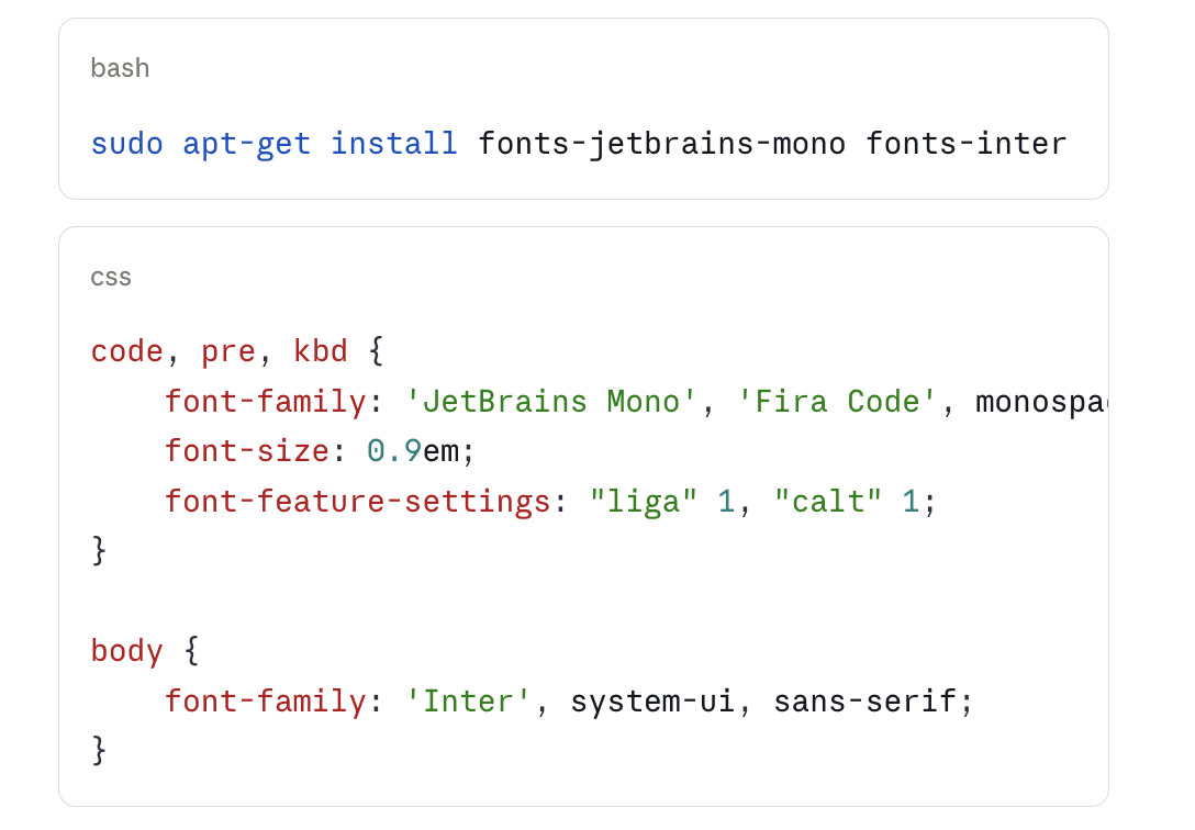
3. JetBrains Mono + Inter
Use case: Developer documentation, technical blogs, API references
Why it works: Code blocks need a monospaced font with strong character discrimination; prose needs a legible screen sans-serif. JetBrains Mono and Inter are both optimised for screen rendering and share a precise, considered design sensibility. The shift between them signals the shift between code and language — which is the typographic communication a technical document requires.
4. Libre Baskerville + Lato
Use case: Print-inspired layouts, newsletters, reading applications
Why it works: Libre Baskerville is a web-optimised version of the eighteenth-century Baskerville model — high contrast, relatively wide, with the authority of historical type without the fragility of thin strokes at screen resolution. Lato is a humanist sans with subtle rounded terminals that give it warmth. The contrast between the classical serif and the contemporary sans creates a strong hierarchy; the warmth in Lato's design prevents the combination from feeling stiff.

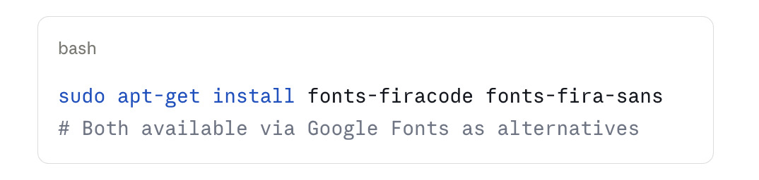
5. Fira Code + Fira Sans
Use case: Developer tools, terminal documentation, programming blogs
Why it works: Another superfamily pairing — Fira Code (the monospaced variant with programming ligatures) and Fira Sans share DNA from the Mozilla-commissioned Fira typeface family. The pairing inherits all the benefits of superfamily design while giving you a capable programming font for code contexts and a legible humanist sans for prose.
6. Merriweather + Source Sans 3
Use case: Long-form reading, news interfaces, comfortable reading applications
Why it works: Merriweather was designed specifically for screen reading — low contrast, large x-height, generous spacing. It handles body text in longer documents better than most display serifs, which are often too fragile for sustained reading at body sizes. Source Sans 3 at a different weight handles headlines with sufficient contrast. This pairing is common in news and publishing contexts because both fonts are optimised for sustained reading rather than visual impact.
sudo apt-get install fonts-source-sans-3
# Merriweather via Google Fonts
7. Roboto Slab + Roboto
Use case: Material Design–influenced interfaces, Android apps, cross-platform UIs
Why it works: The Roboto family was designed by Google for Android and includes slab serif and sans-serif variants that pair directly. The slab adds weight and character to headlines while the sans maintains the neutrality that extended reading requires. The family's wide adoption means the pairing feels familiar in interface contexts — a feature, not a bug.
bash
sudo apt-get install fonts-roboto8. EB Garamond + Nunito Sans
Use case: Literary, cultural, or arts-oriented contexts
Why it works: EB Garamond is a careful digital revival of the Garamond model — warmth, classical proportions, and a literary authority that contemporary fonts rarely match. Nunito Sans, with its slightly rounded terminals, is warm enough to share mood with Garamond without competing with it. The contrast between old-style serif and friendly contemporary sans creates a pairing that feels both culturally rooted and accessible.
bash
# Both via Google Fonts
# EB Garamond and Nunito Sans .ttf downloads to ~/.local/share/fonts/
fc-cache -fv
Using Fontmatrix to Evaluate Pairings
The combination view in Fontmatrix is the most direct way to evaluate whether a pairing works before committing to it in production.
Load both fonts into the active font list. Open the comparison panel with the fonts selected. Enter a representative text sample — for body-and-headline pairings, use a short headline and a two-sentence paragraph; for code contexts, use a code snippet with mixed prose and code blocks.
Reduce the preview size to approximately 14-16px for body candidates and 24-32px for headline candidates. Evaluate three things in sequence:
Contrast: Can you tell the fonts apart immediately at these sizes? If not, the pairing needs more contrast.
Mood: Do they feel like they describe the same project? If one feels formal and the other casual, the pairing has a mood conflict.
Hierarchy: At a glance, is it immediately obvious which font is the headline voice? If not, the role definition needs adjustment — typically by increasing the size differential or weight contrast between the two applications.
A pairing that passes all three at representative sizes in the Fontmatrix comparison view will function in production. One that fails any of the three will produce a layout that feels vaguely wrong to readers who cannot explain why — which is the worst typographic outcome, because it communicates incompetence rather than deliberate choice.